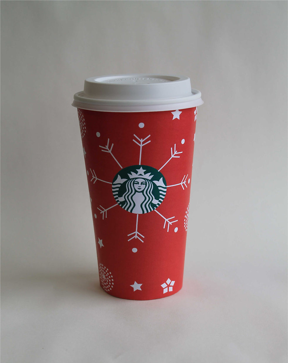
Starbucks Holiday Cup
- Jan 26, 2018
- 1 min read


1) My design related to the cooperate identity of my company is that my design shows a unique but a simple design that is not too full.
2) It has snowflakes and a red background that portrays a holiday vibe.
3) I thinks that they would use my design because it catches the customers eye but is not overfilled.
4) My cup portrays a unique style and fits in the holiday category.
5) I started out by sketching out the design by making the different snowflakes, stars and dots. I recreated the design, made all the designs white and adding a red background to make everything pop.


Comments